

Recently there has been a spate of clients asking "What do I do about this bill?" or "I tried to complete this registration but the link is broken," or "Is this really legitimate?"
So we're going to very quickly address a common scam that people see, and then at the end we'll review with you who you will get bills from.
Here's an email (with some information removed) that one client received:
Congratulations on your domain ****. Have you had your website listed in the search engines yet?
Google, Yahoo, Bing
Submitting your website to the search engines is one of the best things you can do for your website
Give your website the boost it needs and submit your site to the top search engines.
If you'd like your website listed in Google, Bing, and Yahoo follow the link below:
Register *****
This is a common e-mail sent out to people who have just registered a domain name. The people who send it recognize that if someone just bought a domain name, they may be new to the online business world, and therefore may be fooled into thinking that they should spend a lot of money to get listed in the search engines. As a matter of fact, submitting to search engines doesn't require ridiculous monthly fees (or even a single ridiculous fee). Plus they use the fancy term "register" because they know you've heard that word before, and understand it has something to do with owning and keeping the domain, so they use it in hopes that it'll fool you into thinking this is something you must do to keep your domain name.
Interestingly, this particular site's terms and conditions say (in effect) "We can change our terms, conditions, fees, etc. at any time, and we're not responsible to notify you of these changes. It's up to you to keep re-reading our terms and conditions to make sure we haven't changed anything."
Do NOT respond to offers like this.
Here's another one, again, with pertinent data removed. This one came to a client who is not a new domain name owner.
[snipped a lot of personal data, as well as official sounding invoice information, etc]
Dear ****,
Don't miss out on this offer which includes search engine submissions for ****.com for 12 months. There is no obligation to pay for this order unless you complete your payment by 10/21/2015. Our services provide submission and search engine ranking for domain owners. This offer for submission services is not required to renew your domain registration.
Failure to complete your search engine registration by 10/21/2015 may result in the cancellation of this order (making it difficult for your customers to locate you using search engines on the web).
You are under no obligation to pay the amount stated above unless you accept this offer by 10/21/2015. This is a courtesy reminder for ****.com.
This offer for ****.com will expire on 10/21/2015. Act today!
This one, again, makes use of the term "registration" to scare the reader into thinking "Oh no! I'll lose my domain if I don't pay these people!" Granted, later on in the email in the fine print they acknowledge that their service is not required for domain registration, but they are almost certainly hoping you won't notice that. Also, they hint (without saying it outright) that this is a continuation of a service you are already receiving. And finally, they imply that cancelling this order (that you never made) will negatively affect your website.
Incidentally, their email ends with a link that says "Secure Online Payment," but the link is to an http address, not an https address. Not so secure.
Delete this email. The people running this "service" might be operating within the letter of the law, but you do NOT want to get involved with them.
Who Will You Get Bills From?
You will get bills from us, for hosting. You will also get a bill from the company you purchased your domain name from. For most of our clients, the registrar is GoDaddy.com, and for some of our church/charity clients it is YourChurchWeb.net. If you get a bill that implies that it's related to your website, but it's not from us, and not from your domain registrar, it's probably a scam. You should feel free to send us an email about it; we're happy to look at other bills and help you figure out whether they're legitimate or not.
Paying Your Bills
Most of our clients pay us by check, and the address to send a check to is on the contact page of our site. Do not send checks made out to anyone but "Virtu Software" and do not send checks to any other address but the one on our contact page. In this way you will guarantee you are not being spoofed by someone pretending to be us.
When it comes to paying your domain name registration fee, here's a good rule of thumb: if you get a renewal e-mail, don't click the link in the email. Instead, go directly to the web address for your registrar, and login there. If your domain registration is due, there will be a notice, and a link to renew. Do everything from within their website. And if you go directly to the registrar's website, login, and find that you don't have a registration payment due, you can breathe a sigh of relief, knowing that you managed to evade getting scammed.
In case you didn't notice it on the home page of the site, there is now a showcase of some of our client websites. This showcase will occasionally be updated to reflect recent projects, or some of our all-time favorites. Being featured in the showcase gives you, the client, the bonus of having a little extra visibility on the web.
In addition, you may notice that there is a bit of animation in the header; some of the keys on the keyboard change color intermittently, and clicking on any of the colored keys will result in an animation showing some of the past and current projects underway at VirtuWeb.
Here's something cool that you can do from within your administrative control panel: hide and show text blocks on user click.
If you click the link again, it'll slide out and disappear.
This is something you can do on your site as well. This feature is available both in primary page content and in blogs. Read more below to find out how to do this.
Click to reveal!
There are two magical styles that you'll need to create. The first one is called "clickToRevealLink", and the second is called "clickToRevealContent". When you create these styles in your style module, be sure to name them exactly, including the upper and lower case. You can define those styles however you like. A very basic styling might look like this:
color:blue;
font-weight:bold;
cursor:pointer
border:1px solid black;
padding:10px;
margin:5px;
Once these magical styles are created, you can use them anywhere you like. Here's what happens: if you use the clickToRevealLink style in a page, and a user clicks on that text, the user's browser will search through the following text until it finds the very next paragraph that uses the clickToRevealContent style. If the style is found, that paragraph will slide open.
Note that you don't need to have the link and content styles adjacent to each other, though in most cases that's what you'll want to do!
You can, of course, get more "fancy" with your styling of the clickToReveal styles. I uploaded a bullet image (the star) into one of my image galleries, and then used the background-image style to insert the image to the left of the text. You can also use fancy properties like border-radius and box-shadow to make your content prettier.
Bear in mind, however, that some styles like border-radius and box-shadow have (as of the writing of this blog post) non-standard implementation between browsers. In other words, you may need multiple style definitions in order to guarantee that your style works well in all browsers.
Welcome to the wonderful world of styling on the internet. :P
One of the biggest struggles people face in managing the content on their websites is assuming that CKEditor (the editor we use for managing HTML input) is as powerful as a desktop word processor, and that they can make things as fancy on the internet as they can in a document on their desktop computer.
Maybe someday...
Here's the thing: if you build a document in Microsoft Word, and email it to 1,000 friends, when they open it, it'll look just the same to them as it does to you. But if you create a web page and email it 1,000 friends, when they open it, it'll look very different depending on
- their browser (Firefox, Chrome, etc. - or the dreaded Internet Explorer!)
- the size of their display
Here's some advice for designing content for your pages:
- Don't right-align (or left-align) two objects in close proximity to each other. If you have two images you want to block in with text, and they are relatively close to one another on the page, left-align one, and then right-align the next. That will help avoid collisions.
- If you need to give two objects the same alignment, and they are in close proximity to each other, create a style with the style command clear:both; which forces the following content to be shifted below whatever objects are floated left or right.
- Keep it simple. Your content ought to be mostly text, with perhaps some images or other content to highlight things here and there.
- Remember that you can't do *everything* that you could in a desktop word processor. Your goal is to make your site as pretty as possible within the limitations of what you CAN do.
- Check your site in several different browsers.
- Use Firefox's developer tools to see how your content looks in different sized devices.
- Also make use of our responsive design preview mode when you are editing your content.
- If you can't get it to do what you want, take a deep breath, walk away for awhile, and tell yourself that it's probably not YOUR fault - it's probably simply a limitation of HTML design. Then come back and say, "What's a less complicated way of doing what I want?"
What is a media query? A media query is basically the website querying the browser to say, "What kind of display is this?" The answer to that question may include information like "The browser is 800 pixels wide." This is very important information, because your web developer uses these responses to format your website. For example, in this website, if the width of the browser is less than 800 pixels, the format changes from two columns to one, and the menu bar gets narrower. If it is narrower than 600 pixels, the menu bar moves to the bottom of the page.
For the most part, your developer has handled the ugliness of media queries, so your site will function nicely in all size browsers (including small mobile devices). But there may be occasions when you want to change the appearance of your style based on a media query. We make that possible.

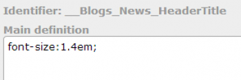
Consider this blog as an example. This blog has a header font which is 1.4em in size. The style command shown above is the command that creates this font.

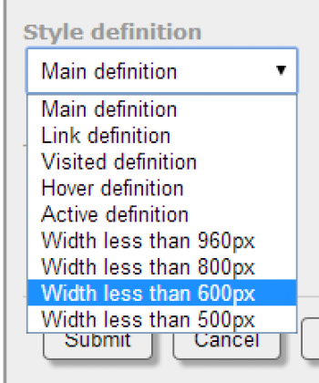
Notice that above the definition is the identifier, and under that you will see the words "Main definition." The main definition is not the only definition; you can override the definition by chosing another definition from the drop-down list:
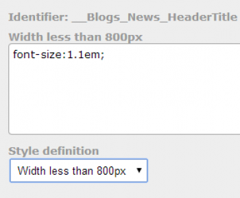
By choosing one of these alternate definitions, you can override the behavior of the style under different circumstances. In particular, I added the style command font-size:1.1em to the 800px definition, as shown here.

Now, if the site is being viewed in a smaller device, that title font appears smaller, in order to help avoid having wrap-around titles.
One important rule to keep in mind is that as you go down the list of definitions, any definition overrides previous definitions. It can be tricky to get used to, and you should practice on pages that are not live on the site, in order to get the hang of it without the public seeing your experiments!
