

In the old days of web design, a client approached a web designer and said, "I want a site, and I want it to look like this." The web designer would build the site, and then, if the client decided they wanted to change the appearance of the site, they'd have to go back to the developer and say, "I'd like to hire you to make these changes."

These days, site owners want a little more control over the way the site appears, without having to go back to the designer for every little change. This is great, but it's also dangerous, because not very many site owners really understand the complexities of styling a website. What's more, now that we've entered the world of mobile, styling a site is even more complicated (see our blog post on Responsive Design), because your web designer specified that your site should be styled differently depending on the size of the browser window that's viewing it.
Complicated? Oh yes.
So how do we strike a balance? Well, we store all the site styles in two places. The first is in a stylesheet called styles.css. This stylesheet contains all the really important structural details of your site, as well as the mobile optimization styles. Your administrative software doesn't give you access to this stylesheet - it is immutable.
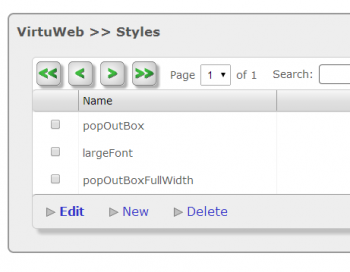
The second stylesheet is called custom.css. You might have guessed from the name - this is the one you can change. Any time you visit the Styles module of your admin software, you are modifying that style sheet.
This lets you have some control of the visual look-and-feel of the site, without quite as much risk to the overall layout of the page. (It's still possible to cause issues for your site, so play with the styles cautiously, and view the site each time you make a change!)

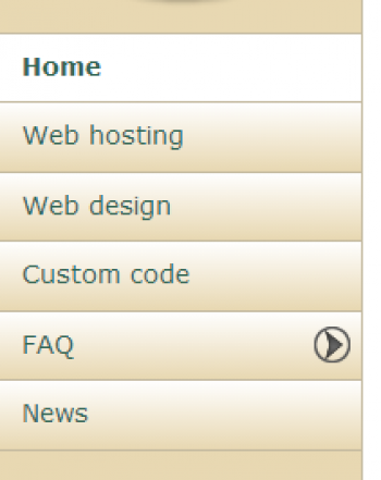
So let's talk about a specific example. Let's talk about the menu bar on this site. Here it is. You can click on the image to see it full size. I was thinking to myself that it would be nice if the menu option for the news blog had something that set it apart from all the others - something that made it stand out, so visitors would have their attention drawn to it.
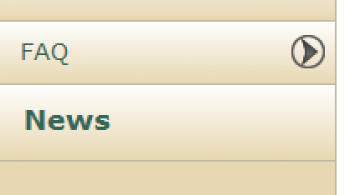
I know - I'll make it bold, and a larger font! So here I go; I'm going to edit my News menu item, and under "Advanced Features" I enter "News" as the name of a new Style Group. What happens next? When I save the menu item, two new styles are created. They are called _menu_News_Selected and _menu_News_Unselected. Modifying those styles will change the appearance of the menu. So let's try changing the _menu_News_Unselected style to: font-weight:bold:font-size1.2em;.

Now my menu looks like this.
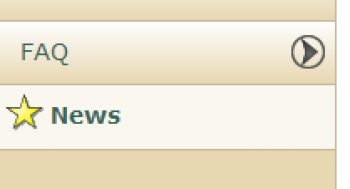
But I don't have to stop here; I can try other things. For example, what if I want to have a star next to the menu? I create and upload a star image to one of my media galleries, then set the css background properties to include that star - and don't forget to pad the text on the left to make room for the star! And now I have this.

Obviously, website owners need to have some understanding of CSS to play around with these features, but it does give you some control over the appearance of your site.
